Category Archives: Art

Full Spoons at Medicine X

I heard a few people talking about spoons on Friday morning at Stanford’s Medicine X conference . They were wondering why artist-in-residence Rachel Stork Stoltz, had asked us all to bring a spoon to the conference? After listening in a bit, I leaned over and tried to answer their questions. The spoon theory was created by Christine Miserandino and is a powerful way of explaining to a healthy person what it feels like to live with a chronic illness. You start the day with a finite amount of energy and as you move through the day you use quanta of energy (spoons) with even the smallest tasks of daily living. You count your spoons and may find you do not have enough spoons (energy) left to do what you want or need to that day because of the demands of your illness.

At its best moments Med X was a masterpiece of collaboration. It was a bringing together of patients, physicians, thought leaders and innovators to work together to discuss the future of medicine. Our recursive efforts mirrored and repeated each others’ in a way that built a powerful basis of understanding to move forward with.

Pamela Ressler opened her panel discussion on communicating the experience of illness in the digital age with a stunning quote from Susan Sontag:
Everyone who is born holds dual citizenship, in the kingdom of the well and in the kingdom of the sick. Although we all prefer to use the good passport, sooner or later each of us is obliged, at least for a spell, to identify ourselves as citizens of that other place.
Using an understanding of this commonality allowed us to enter into a dynamic dialog. I left the Med X space with more questions than answers. The questions are in themselves powerful motivators.
  • How will I recognize the daily efforts of patients in the days of their lives not in my office?
  • How will I be as caring as an old-school physician and as vital as a fully connected 2.0 MD.
  • How will I allow a space of communication about patient’s emotional challenges (as well as those physical)?
  • How will I shape my efforts to motivate health change through social media?
We did bring spoons to Med X and used them to create a sparkly, swirling tower of energy. We were each asked to think of what saps our energy and what refills our spoon count. I paused between lectures on Saturday and stood in the sunny afternoon decorating my spoon with wire and beads and copper. I tried to think as I worked not only of my own energy but of the more carefully counted energy of patients with chronic illness and hoped that they too felt a renewed spoon count from the connections forged at Med X.
Photo (3)
Rachel Stork Stoltz and our spoons

Findling

There is a rock in Switzerland that is making me think.

Once I heard the author Anne Lamott speak in part,  about her writing process. One tip that has stuck with me for many years is her recommendation to keep a notebook for ideas and impressions that make one think. (As an aside, another tidbit from this author comes from her book Operating Instructions in which she discusses new motherhood and describes the way her postpartum belly lays next to her like an obedient puppy). Last week, a cool rock made me think and therefore, entered my notebook.
It lays on a hillside somewhere outside Zurich and is huge, really more of a boulder. It has been finished with a fabulous iridescent blue/green/purple varnish and is presented as art. As such it might bring me back to my ongoing discussion of what exactly, counts as art. But, not now.

The rock is named “Findling”. I asked my friend, my perpetual translator of all things foreign there, what this word means. He did not pause in the answer that it means “a rock left behind after the movement of a glacier”. Not that I question my fine Swiss-German translator but once back in America, I looked up the meaning of “Findling” and found a few options:

  • an infant that has been abandoned by its parents and is discovered and cared for by others.
  • a white German wine grape variety
  • and to be fair: an erratic boulder

Putting aside the slow nature of a glacier’s movement, I have always imagined them as being quite destructive to anything underneath. Having lived for a bit on a glacier in Antarctica, I can tell you that glaciers look huge and mean. Any rock left behind has seen a bit of tumbling. This particular Swiss rock? It came out polished and pretty and can serve as a metaphor for us all.

After the slow but painful tumbling that life can present, the strong ones amongst us come out intact. And, in some cases, even better off. And sometimes even iridescent.

Manifestos For Art

A friend of mine sent me this yesterday. He had read a print version of my post Art for the 99% and immediately knew what I was saying had been said by others before me. And well. And in the year 1984!

Manifestos written to present the intersection of art and politics are not new; the list of them is long. I especially enjoy Claus Oldenberg’s

“I am for an art that is political-erotical-mystical, that does something other than sit on its ass in a museum.
I am for an art that grows up not knowing it is art at all, an art given the chance of having a staring point of zero… “

Then there is the Stuckist Manifesto which ends, confusingly in this way:

Stuckism embraces all that it denounces. We only denounce that which stops at the starting point — Stuckism starts at the stopping point!

The Stuckists define themselves as being anti-anti-art or against anti-art and for art. Huh? Simpler to understand is what my friend sent me. Enjoy!

How to Resist Chocolate (or, using art for appetite control)

Yesterday my chickens again woke me up too early; they seem hell-bent on making me into a morning person. And grudgingly, I will admit I enjoyed the chance to have my coffee and catch up on my reading alone. I picked up the latest issues of Nutrition Action Newsletter and Bon Appétit. What I found to read was too fun to not share.

Apparently some researchers in Zurich (Appetite 58:1109) are looking into the effect of subtle food related cues around us as we eat. What things in the space around us cause us eat more or less? Well, right up my alley, these wise Swiss researchers examined the effect of different works of art on one’s appetite for what else? Chocolate. If the study subjects were given free access to those fabulous Swiss chocolates while in a room where a screen portrayed images of skinny Giacometti sculptures they ate less than if the screen portrayed Rothkos. How cool!

In the same magazine, there was an article discussing the need for people to eat fewer calories per day after age 50 in order to maintain the same weight. Depressingly, as we age our metabolism slows no matter how much hard exercise we get each day. Now putting the two articles together in my mind made for some fun. What works of art should I put over my kitchen table? The Giacomettis might send the wrong message to my soon to be a teenaged daughter. The Rothkos are too expensive (one sold earlier this month at Christies for nearly 87 million). What else then? Carravagio’s David with the Head of Goliath could slow even my 16-year-old son’s appetite and might help decrease the food bill a bit. What would our appetites do under a Bruce Nauman neon sculpture? The Wedding Feast of Cana by Veronese might upstage my cooking (this enormous painting is most notable in my mind for thoroughly upstaging the Mona Lisa at the Louvre, if you are ever able, go to the Louvre, stand in front of the Mona Lisa with the crowd then, turn around and look at this magnificent piece to see what I mean). We might eat more fruit under a Cezanne. More soup under a Warhol? Would I hang a Rubens to warn my subconsciousness of the consequences of eating those chocolates? No, more likely when redecorating my kitchen I would just throw wisdom about calorie restriction to the wind, let my sweet tooth take over and happily hang a Thiebaud.

After daydreaming in this way with my cup of coffee growing cool, I opened the Bon Appétit. It featured a yummy looking recipe for Roast Chickens with Pistachio Salsa, Peppers, and Corn. I may not be able to afford the Rothko but… I know where to get the chickens. Cheep.

©

Art For the 99%

A recent Sunday  N.Y. Times article “Show of Hands Please, Who Can Buy Art?” described the current art auction season in Manhattan where

despite trouble outside, life in the art bubble remained effervescent.

In part it asked the reader to consider the contrast between the extreme wealth of those actually buying art and the other 99% of our country. A stark contrast indeed; one that raises the question of who art is meant to be for?

The rising prominence of street art speaks to this question. Through time art has been largely subsidized by the wealthy. Caravaggio and Rembrandt both had their patrons. Ed Ruscha (whose Strange Catch For a Fresh Water Fish sold this fall in auction for $3.8 million) has had numerous commissions from wealthy supporters for paintings, t-shirt series and even a painted private jet. Art generated by wealthy grants can remain cloistered in the world of the rich or upper middle class but, surely art itself is the great leveler? Created from the passion and drive of an individual and meant to move the soul of everyman.

We have watched graffiti with increasing acceptance as it has evolved from simple, defacing tagging to being in some magical cases, art. I find graffiti sprayed on trains often forms just such magic. The pairing of this art form (meant to be temporary and fleeting) painted on trains that move through time and space with their roving art exhibits can often be quite spectacular!

Now there are increasingly other forms of art to be found on the streets. This is termed post-graffiti or street art and is separate from the potentially vandalizing nature of graffiti or corporate-sponsored works. The art itself ranges far from aerosol paints to mosaics, ceramics, stickers and yarn.The works are fun, startling and sneaky; you may see a window painted into a wall, a tree with a crocheted trunk and branches or, a ceramic man rising, seemingly formed out of a mud puddle. “Yarn bombing” in particular seems to be urging us to take life less seriously; to smile as we walk by. Some works make us think; one wheat paste applied poster proclaimed “Let’s fall in love like both our parent’s aren’t divorced” asks us to consider the effect of our family story on our current loves.

Protestors far and wide are occupying in an attempt to question the increasingly unequal financial conditions of this time. The artists of our world, ever a forward-thinking lot, have been quietly occupying our streets for years. Their work reaches beyond the grasp of those in the rich art bubble and straight to the heart and minds of those of us in the other 99%.  Enjoy!

Bobbleheads, Packaging and Wise Career Choices

Sometimes life presents you with unexpected learning opportunities doesn’t it?

Last Thursday I went with my 12 daughter to see k.d. lang in concert. She needed to write a report for her band class on observations made while seeing a live music performance. We looked around for a local show and stumbled across the listing for k.d. lang’s show. It seemed perfect to me – my daughter could get her report done and I could enjoy some good music.

My daughter’s report had to list the instruments played, comment on sets and costumes.  Critique the music itself. She had to watch the mannerisms of the musicians (apparently some of the trumpet players in band move like bobble heads with each breath).

I hoped that there would be another lesson presented to her that night. A lesson of acceptance. In a review of k.d. lang’s singing, The Times of London declared:

It’s a quirk of the music industry that one of the sexiest, most sensual voices in all of pop music comes not from some raven-tressed siren in a glitter-dress but a middle-aged woman with a utility haircut and a penchant for male tailoring.

Exactly. I wanted my daughter to see that talent and success, wisdom and sexuality present themselves in all kinds of packages. Each worthy of her attention. I felt vaguely guilty for “using” k.d.’s concert as a teaching moment  rather than just an opportunity to listen to fabulous music but – so be it, off we went.

Turns out there was a better lesson waiting for us that night. As I watched k.d. on stage it struck me that although she gives this very same performance night after night it has not grown dull for her. Her songs soar, her feet skip and she smiles. A smile described in the NY Times as being the size of Montana, forms an invitation for us to join in the fun.

The next morning at work I was reminded that my job as pediatrician has some of the same fun worked into the routine. One 9 month old smiled so continuously and contagiously at me that I had to apologize to his mother for my own grin. An autistic boy with an uncontrollable fit of ticklish giggling while I was examining his belly made me give in to the giggles with him. How lucky k.d. and I are! And, what better lesson than showing my daughter that one’s work should feel at least in part, fun?

Lessons learned? Don’t be a bobble head.  Impressive people come in many packages. And careers should be fun. Choose well dear girl!

Sublime and Surreal; A Birthday Vocabulary Lesson.

I walked to my car a few nights ago on my birthday and was stopped in my tracks by something in the atmosphere there on the street. It was twilight; the sky an electric blue and the trees and houses nearly black silhouettes against the sky. The street light stood as a golden guardian. The only sound out there in those few moments was a rustling of the leaves in those dark trees caused by a gentle breeze.

It was distinctly dreamlike. Surreal even. It was exactly as if I were standing in Magritte’s painting The Empire of Light II.

Earlier in the day I had been hiking on the bluffs over the ocean with two friends. At one point along the trail we paused. They were chatting, I was breathing. I looked up to see the most fabulous sky. There is no other way to put it but to say it was “sky blue”. That bright light blue that can be bought in a tube. There were fluffy clouds in cartoon-character shapes floating by. Standing there I again felt I could  have been standing in a painting: Magritte’s The False Mirror. It transformed my hike into a sublime experience.

These moments began a vocabulary lesson at dinner last night.

Surreal:

marked by the intense irrational reality of a dream

Sublime:

of such excellence, grandeur, or beauty as to inspire great admiration or awe

The rest of my birthday weekend continued the theme. A spa massage: sublime. Practicing the massage techniques I had “learned” on my 10 year old and savoring the feel of his strong little body: sublime. Apricot almond birthday cake: sublime. Fighting an hour-long, block-wide nerf war, girls against boys, with my kids and their friends: surreal.

Yes, having the ultra-pacifist mom shoot her kids repeatedly aiming to “kill” was indeed surreal. But, it was also such a sublimely fun hour capping off an at times dreamlike weekend.

An Accident, an Artist and a Poster

Several years ago I was driving along the north coast of California. As I rounded a sharp, cliff-lined bend I came upon an accident scene. A girl in her early 20s had been riding her bike and was hit by a semi-truck. The truck was long gone but a gaggle of well-meaning good Samaritans was at the scene. I joined them reluctantly (not wanting to stall my journey and put my own kids at risk as they waited by the roadside). As I walked up and assessed the scene I hoped to see that all was well and that I could quietly leave. But that wasn’t to be, I was needed. When I saw this I told the small group that I was a doctor and remember now the relief this brought to all of them. Imagine their fear, there on the coast with this wounded girl and help a long time coming.

The girl ultimately did well and, is not the point of this story. Instead her accident formed for me the basis of a happy accident of acquaintance.

Every year on Labor Day weekend my family travels that same coast road and in the town we stay in is a yearly art show. The year after the accident I was touring the show, which is held in multiple studios, homes and galleries. As I walked into the seaside home of one painter I was surprised to be greeted by her with a gushing of enthusiastic greetings and thanks. She had been there at the scene of the accident the previous year,  and remembered me. From this serendipitous meeting has come a nice acquaintance based on yearly trips to see her and her art.

This year on the usual day that I tour the show, I was tired and feeling a bit more introverted than usual. I was tempted to walk by her house and out to the beach to sit alone. Instead, I talked myself into heading in and by doing so, reaped the benefits of making the effort. Her art is astoundingly beautiful. Her plein air paintings have evolved to be increasingly and delightfully abstract. They show planes of space defined by thickly laid paint and a powerful use of color. For me they are as if Rothko has come back with a palette knife to paint landscapes. She and I enjoyed a long conversation about art started off by my asking who she is most influenced by. We looked at books of hers and discussed style, color and method.

Our conversation brought to mind a word that has come to mind several times lately: process.  In the sense of it being:

a natural phenomenon marked by gradual changes that lead toward a particular result – the process of growth

One of the paintings my friend showed me connects to this sense of appreciating process. It was by Paul Wonner, depicting two men sitting together. There is great feeling in the abstract strokes of color that blurs their faces but, leaves feeling intact. Perfect in a way. And yet, Wonner chose to leave obvious drips of paint across the canvas, even on one man’s face. Obvious imperfections decisively left. Why?

Process used in a psychological sense can mean taking the time to work towards becoming a better version of our selves. To generate this evolution though one needs enough self-reflection to be able to say “Look! This is how I did it – this is how I changed!” In viewing Paul Wonner’s painting of the two men it seems the drips were left as an indication of his process. They are leading us to see the gestures, the spaces, the feeling. He is saying “Look! This is how I did it – see my broad brush strokes, see my drips?” He was perhaps, asking us to look at how his beautiful painting evolved. He may have been asking us to see that the drips on his painting are part of the process that generated the emotional meaning held in its planes.

I saw a poster on a city street this week that said:

“art is not a moment; it is a process”

Indeed. Art like life, is best when it involves a process of evolution and observation.

Why Make Art? A New Answer Arises, Stitch by Stitch.

Art makes me think. It has happened before and it is happening now. Funny thing is that I am not just set to thinking by the big, important art but also by art that takes itself less seriously.  I am certain that Rodin’s The Thinker has never made me think. But Calder’s whimsical Performing Seal has.

There is art afoot, art about towns today that is making me smile. And yes, think. Is it Art? What is art? Why make art? A new answer arises: to make us smile again. Maybe at times that is all we really need from art.

Have fun looking and oh yes, definitely show your kids!

http://ht.ly/61VST  Scroll two down, click under the tree on more information to find “Yarn Bombing / Guerrilla Crochet – A Collection”.

A Twinkling Metaphor for the Path Towards Health 2.0

In my ongoing stream of consciousness about art and medicine a new connection has worked its way to the surface. Medicine it seems, is in a state of flux, a state of change and evolution. The hubbub about this is alive in Twitter feeds and on many physicians’ blog sites. The dialog has been centered on the role of media in healthcare, of the use of the internet in patient care, the grooming of new medical students to be our future leaders. The path forward towards the grand new world of health 2.0 is a shifting one with moments of clarity and moments requiring innovation and faith all discussed hotly in the world of social media.

This flux is nicely brought to life in a work of art I recently enjoyed. The artist Charles Sandison produces digital installations of grand physical and philosophical scale. Moving, flowing, changing and in the case of his “Origin of Species”, evolving. This piece is made of points of light swirling around the walls and corners of a darkened room. The lights coalesce at times, into words and form – two words at a time –  the entire text of Darwin’s manuscript on evolution. As words meet each other they form the next words in an unscripted display that will take two years to be completed.

when the word man meets the word woman, the word child is produced; and when man or woman bumps into the word threat, the word dead replaces them ~ Ken Johnson

This seems a fine metaphor for our collective musings on the path forward for medicine. The lights in our heads form words that meet in the blogosphere to merge and change into the next iteration of ideas. This forward progress may take some time but – won’t it be great to watch? I would love to see what Sandison would come up with to display our collective efforts as we evolve.

Perhaps on the wall of lights that describe healthcare 2.0 in words two by two we would see that:

“social” and “media” will merge into “expected”

“empowered” and “patient” will merge into “reality”

“work” and “balance” will merge into “obvious”

©

Putting A Name To It

Four years ago my brother-in-law suddenly, and to us unexpectedly, committed suicide. It was a violent and selfish act, devastating in a far-reaching way. He hurt those who loved him, and in unforeseeable ways he hurt even those who did not know him. My children had loved him and were stunned. Their classmates in 6th grade, 3rd grade and kindergarten who did not know him, learned the story from our kids. Imagine! The children in my son’s kindergarten had to learn about suicide far too soon; it was impossible to keep the story silent in our relatively small community. And yet, would silence have been desirable? I think not.

To help my children grieve and to have a designated time to remember his life we have begun a tradition. Each year  our local chapter of The National Alliance on Mental Illness (NAMI) holds a sunflower art contest. The contest is held during the same week he died. We talk about ideas for our entries for weeks then, come together and work, creating individual and group entries. Our neighbors have even joined in. It gives us a set time to personally or collectively, openly or silently think about him.

This year after painting some fabulous flowers, our neighbor Delaney felt stumped. The contest entry asked for a name. What a challenge! Delaney agonized. I suggested that leaving it untitled was acceptable and tried to explain that many of the best artists do just this. But untitled felt, I am guessing, unfinished.

Shortly after I had the good fortune to be walking through a fabulous museum soaking up the art there. The titles kept jumping out at me. Certainly many artists do leave their work untitled but, often an artist is asking us to focus our attention in a direction of their choosing. Richard Wentworth’s room filled with books floating suspended above our heads is named “False Ceiling”. Perhaps a gesture pointing us towards the falseness of the notion that books contain all knowledge in unbiased, unlimited form? At first Tony Cragg‘s sculpture in the Istanbul Modern Museum looks like a study in sinuous, sensuous form. But after reading the title, “Ugly Faces” that is all one can see. Gone is the sexy sculpture, leaving behind just faces in profile. Ugly ones.

Which brings this rubber band story back to my brother-in-law’s death, those kindergarteners, and the efforts of NAMI. By naming the thing in front of us we make it hard to ignore like those “Ugly Faces”. “False Ceiling” became a statement that was hard to stop thinking about. By being comfortable with naming depression we cannot ignore it, we make treatment attainable. NAMI strives to help us put a name to what is all too often right in front of us. To name it allows us to help those who suffer. To leave it untitled allows us to make our own personal and perhaps incorrect interpretations. Wentworth said:

I think I shouldn’t give things titles. I sometimes cringe at it. But it’s like naming the cat. There is something about the act of nomination — sometimes I really love it, like launching a ship.

Sometimes we cringe from naming the suffering in front of us. However, doing so might launch a ship or two…ships of hope.

©

Delaney’s painting? It was enthusiastically named “Bust a Bloom” .

A gallery of some of our sunflowers:

The Rothko Story

Let me tell you a tale. A tale of the depth of emotion that art can evoke. A tale that will make you pause. A tale I hope will demonstrate why art history is valuable.

As trite as it sounds, I have a favorite artist, Mark Rothko. And, speaking of trite, I was looking at a You Tube compilation of his work today. At the end were comments, lots of comments. I started to read a few but got hung up on the first one. A comment so glaring for demonstrating the author’s complete lack of understanding of the history behind the art that it catapulted me here to write.

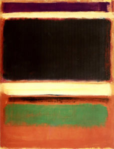
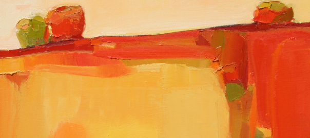
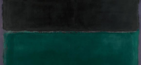
Mark Rothko (1903-1970) was an intelligent and philosophically inclined man who won a scholarship to Yale but left New Haven after two years to join the Manhattan art scene (he was later awarded a degree from Yale). There he began his art education with classes in representational drawing and painting. Ultimately however, he became known for abstract painting and would be placed in the group of artists working in the 1950’s called the Abstract Expressionists. Rothko filled huge canvases with large blocks of vibrant colors.

I paint very large pictures because I want to create a state of intimacy. A large picture is an immediate transaction. It takes you into it.

His technique was novel and refined; he painstakingly applied series of layers of thin washes of colors that added up to creating a luminescence and a remarkable shimmering effect.

Rothko disliked giving up these masterpieces of scale and light and color.

It’s a risky business to send a picture out into the world. How often it must be impaired by the eyes of the unfeeling and the cruelty of the impotent who could extend their affliction universally!

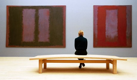
In an attempt to control the fate of his canvases he became famous for exerting control over how they were displayed. They were to be hung so that there was little white wall surrounding them; preferably in a room with only other paintings of his. The paintings were to be hung as low as possible and in quite dim light. He meant the paintings to be  ideally viewed at a distance of only 18 inches so that the (single) viewer would be enveloped by the experience as Rothko had been enveloped while painting them (he wanted to create a feeling that the painting was not static but, continuing to evolve as it was viewed). And, he intended the viewer to have quite the experience. In his fabulous book The Power of Art, Simon Schama says “no other painter in the history of modern art – perhaps in the entire history of painting – was so obsessed with the relationship between the artist and his audience”.  His goal was that we would be transported by his art. Once when a reviewer commented that Rothko was simply a master of color he scathingly responded:

I am not an abstractionist. … I am not interested in the relationship of colour or form or anything else. … I’m interested only in expressing basic human emotions — tragedy, ecstasy, doom and so on — and the fact that a lot of people break down and cry when confronted with my pictures show that I communicate those basic human emotions. … The people who weep before my pictures are having the same religious experience I had when I painted them. And if you, as you say, are moved only by their color relationships, then you miss the point!

In 1958 Rothko was offered an enormous (for the day) retaining fee to produce a set of murals to hang on the walls of the new Four Seasons restaurant in the building designed by architect Mies van de Rohe and owned by the Seagram’s distilling company.  He then rented an old gymnasium and erected scaffolding to model the space at the Four Seasons and began working. In a short time there were dozens of canvases of red, maroon, black, brown and flaming orange. From these he planned to choose the best nine to completely cover the walls all around the main dining. They would thus become more like murals, than individual paintings.

Rothko’s works became sought after, his income soared to 60,000 in 1959 and yet, he mistrusted the wealth that bought his work. Simon Schama explained that Rothko’s fear was having the paintings become “overmantels” or expensive wallpaper for the rich. Perhaps it was this fear that motivated Rothko to go with his wife to the newly completed Four Seasons restaurant one night in the summer of 1959. There they dined amongst the glittering decor, clinking glasses and stylish Manhattanites. There it suddenly be came clear to Rothko that his murals were not meant to hang on those rarefied walls. He felt, likely rightly so, that the diners would not understand his work let alone have the sort of emotional experience he intended for a viewer to have. He turned down the money – approximately $2 million.

Anyone who would eat that kind of food for that kind of money will never look at a painting of mine.

Then followed years of struggle with alcohol and creation of paintings of an progressively dark palette. These  somber paintings seem to represent a final step down into a darkening of spirit. His health failed, his marriage failed and he continued to drink and smoke. He became increasingly depressed.

On February 25th, 1970 Mark Rothko was found dead in his studio, his wrists slit. Hours later on the very same day, a shipment of nine Seagram murals arrived at the Tate Gallery in London to be hung in a room alone according to strict specifications.  Jonathon Jones wrote in a recent blog post for the Guardian that “Rothko was fascinated by the idea of shaping a room with art, using abstract painting as a type of architecture”. He meant to create a physical space where his canvases could work with the surrounding architecture to move viewers to meditate. He meant to induce a religious experience. Upon his death he had created just this.

For dear reader, now that you have heard this tale, you can see that art history is powerful. That an understanding of the history of a work of art can create a heightened appreciation of it. To the uneducated You Tube viewer, Rothko’s paintings may look easy (they are not – remember the groundbreaking layering of pigment he developed and the precision with which he displayed them). To the uninformed viewer they may appear an attempt to generate exorbitant sums of money (they were not– remember his mistrust of wealth and that his constant desire to have the viewer emotionally connected led him to turn down $2 million). So, the moral of this story might be that one should ask about art before you judge. And then with your knowledge, enjoy.

~

This is a powerful tale and by telling it to your children over dinner and showing them some of Rothko’s art (try the youtube compilation) you will begin to hook them on the world of art. You may worry about telling them about Rothko’s suicide but then, you could view this part of the tale as a “teachable moment”. It presents to you an open door to start further dinner discussions about depression, addiction and suicide. These are all parts of the world experience that we hope our children avoid. You have a powerful ability to influence their choices if you are willing to discuss these difficult topics. It has been sown that children whose parents frequently talk with them and clearly convey their expectations regarding drug and alcohol use are much less likely to end up abusing substances. Feel your power and start talking. To help here are a few resources.

Gifts of Transcendence

I have wonderful friends. Ones who support me and understand me. So, when they heard I was injured and stuck lying around; off my leg for weeks to come, two of the most insightful ones brought me a gift of art. Both went to museums and came back to me with Rothkos. One with a beautiful print and, one with a powerfully written tale of his trip to see a Rothko in my honor. They understand me well.

Some works of art have the ability to transport us emotionally to another plane of experience. Certainly music will do this for most of us. Think of the elevating power of the final movement of Beethoven’s 9th symphony, the Ode to Joy or listen to Pachelbel’s canon. Visual arts too have this power. The Shiva Linga paintings that I discussed in an earlier post are a clear and direct example of this. They were painted as devotional images intended for use during meditation to help the believer focus their prayers. The paintings depict one of the forms of the Hindu god Shiva, the god of destruction and transformation. He  oversees death and rebirth. These paintings therefore are meant to represent transitional space between creation and dissolution.

Despite my not being Hindu or particularly meditative, I found these paintings absolutely compelling. They are simple and repetitive; painted on found scraps of paper by individual, anonymous practitioners. Similar yet interesting in their differences.  As I stared into their central black ovals I felt the world around melting away from behind me while the black space grew to envelope my thoughts.

I have to wonder if Mark Rothko perhaps saw and was influenced by similar paintings. There are parallels to be found in his work: the spare design, simple color blocks and, the intended purpose of transcendence. Rothko meant for us, the viewers stand close to and alone in front of his paintings. He meant for us to be embraced by them. A sensuous, tragic, moving embrace. So now I in possession of my own Rothko’s, feel able to extend beyond the limits of my own experience. I am momentarily lifted beyond the couch and into the enfolding spell that art can provide.         ©

Highlights From a Year of Art-looking

My muse has been distressingly quiet lately. Sitting here earlier I was wondering if maybe I need a trip to a museum to stir up the creative juices but, alas… no trip in the works at this moment. So, instead I began thinking through the art I have seen or studied in the past year, turning the virtual pages in my mind. It was a good year for travel; a good year for experiencing art. Here are some of the highlights:

  • Ai Weiwei’s Sunflower Seeds This sculpture presented by the conceptual artist was made up of over one hundred million porcelain sunflower seeds. The seeds we handmade by hundreds of artisans working in small workshops in the city of Jingdezhen, China. The exhibit is meant to evoke thoughts of the role of the individual in society, our increasing numbers and the effects of our needs, wants and demands on the world. It is made all that much more meaningful by the recent arrest of Ai Weiwei.
  • Shiva Linga Paintings These were perfectly introduced by Franck Andre Jamme:The thought has often occurred to me that perhaps never in the universal history of painting, have works at once so mysterious and simple, yet so powerful and pure ever been produced – a bit as if, here, man’s genius had been able to assemble almost everything in almost nothing”. The were created as aids to meditation and indeed they are powerfully meditative. While looking at them, I had to wonder if Mark Rothko studied them such are the parallels between his work and these paintings both in simplicity of design and intended purpose.
  • Rivane Neuenschwander: Rain Rains This incredible installation in the New Museum in Manhattan was introduced rather limply as: being “an environment of leaking buckets that are controlled from flooding by a Sisyphean recirculation tended to by museum staff in four-hour cycles”. This description fails. Rain Rains formed what may have been the most for me moving few art-related moments of 2010. The slow leaks of water from suspended metal buckets to matched buckets below, formed a symphony of plonkety-plonk sounds that filled the room and my heart. Perhaps this again begs the question of why certain art moves each of us individually so much. Why was there, for me, such transcendental power in this room of “rain”?
  • Tino Sehgal’s This Progress: Surely this would be on the list made by any NYC art-goer over the last year or so.  As I walked up the ramps in the Guggenheim I was in turn approached by 4 people of increasing age (from about 11 to 65) who walked with me for a level. As we walked we talked. I was asked in turn (increasing  in age and altitude with each question): “what is progress?”, “Is personal choice always good?”, “what is the meaning of the word amateur” and “This is progress?”. I have continued these magical discussions in my mind since.
  • Jennifer Steinkamp’s Rapunzel. I spend much of my time in museums wishing that all good art had a comfortable bench placed right in front of it to facilitate relaxed contemplation. Such seats are rare. Rapunzel  is hung in a stairwell at the Crocker Museum. The steps their form an unusual but restful nook to perch in while watching these enchanting swinging vines; perhaps the best “bench” of the year.
  • The ever-moving ephemeral art of graffiti passing by on trains continues to fascinate me.It even inspired some of my own efforts:

©


©

Why Pie?

I have a test question for you. If I spent my Sunday trying to perfect Boston cream pie whose paintings did I enjoy on Saturday?

It was a rainy Saturday so my daughter and I went back to the Crocker Art Museum. The art we soaked up got me thinking and, questioning again. I have asked here “Is THAT art?“, “What IS art?” and “Is graffiti ART?“. Now I am led to ask why did the artist choose that subject; why THAT art?

We saw a broad range of art at the Crocker. First we spent an hour looking at an exhibit by John Buck entitled Iconography. Every strikingly beautiful print was as striking in its capacity to generate thought. They were very large format wood block prints carved with bold designs and filled from top to bottom with intricate details. It was those details that got the discussion flowing. One print was of a bottle filled with carvings depicting the effect of the arrival of the white man on the Native Americans – the deadly cost of our disease and alcohol. Another depicted the environmental price of deforestation and oil drilling.

It was obvious why he chose these topics – they are meaningful, important and compelling.  Another exhibit we saw was less so. It was simply confusing to me why Daniel Douke’s work in the exhibit Bytes of Reality was there. He showed great technical skill in his ultra-realistic paintings of mailing boxes. They seemed to be a cross between Duchamp’s found objects and Warhol’s Brillo boxes. The Crocker’s website states:

By making these discarded boxes art, he gives them permanence and value, challenging our assumptions about reality and artifice.

At the risk of sounding uneducated, I don’t get it. A docent tried to explain the work to me but left me wondering if I was looking at the emperor’s new clothes and feeling that some one was telling me a story already told well enough before. Besides this judgment, my biggest question was this: “WHY mailing boxes”?

Next we entered the permanent collection which includes the works of many California artists. Positioned to the forefront; in the first room is a group of paintings by Wayne Thiebaud. Thiebaud paints with thick brush stokes of vibrant colors; bright white, edges of purple and orange. He depicts scenes of San Francisco’s rollercoaster streets and some central valley landscapes but is most known for desserts. Not deserts, no. Cakes, gumballs, pastries and pie. Boston cream pie to be exact. I love pie and really enjoy his work. It makes me hungry. But that day mixed with my hunger, was that same thought. Why does Thiebaud paint dessert?

Two great artists. One etching monumental works of powerful concept. One painting with mouth-watering precision, pie. Why the pie?

“If the world were a perfect place,” wrote Michael Kimmelman in the New York Times in 2001, “the Wayne Thiebaud retrospective that has just opened at the Whitney Museum would be nailed to the walls for good and we would be free to stop by whenever we needed to remind ourselves what happiness feels like.”

So indeed, some art may just be meant to make us happy.

Now, does anyone have a better recipe for me?

Pink and Purple Circles

Promoting arts education is crucially important for our kids. Before I leave the background discussion of why I need to address one last point. Arts education is often taken to mean creating and performing art. Art history is also of value. This involves art criticism, the academic study of art with its stylistic and aesthetic context. It gives us the ability to understand the sublime that is art.

Briefly, three ideas for why the contextual study of art should be included in the standard arts education:

  • Understanding what influences the framework that art hangs on allows a more enjoyable connection with it. This is likely better explained with an example. My kids all went to a wonderful parent cooperative preschool. On my workdays there I loved being at the art table. Over the years I became increasingly impressed with the influence the children had on each other’s artistic styles. There might be three kids at the table painting away. One more would join in and start painting say, concentric pink and purple circles. Soon I would notice lots of use of pink and purple and lots of circles appearing across the table. Over time I worked with the teachers to form a yearly art exhibit where we hung the kids art on the fences in the school yard. It was grouped by period and context. It was a joy to see how the kids had developed together! This ripple effect or evolution of style is seen in our study of major schools of art. Artists influence each other and create an ongoing evolution of artistic style.
  • An understanding of the evolution of tastes in art generates acceptance of diversity. Artists through time have often been scorned when they challenged commonly accepted ideals with new approaches. They take a new approach that eventually becomes the accepted norm (think pink and purple circles). Seeing this progression as it has played out repeatedly through time can teach kids an acceptance of new thinking, new looks, innovative approaches. It can help them be less judgmental of differences in those around them.
  • Understanding the mechanics of creating art is valuable. Artists work hard. Really hard. They practice day in and day out in order to produce what can often appear simple. Have you ever looked at a modern painting and thought “I could do that”? Likely, you could not. Professional artwork requires both innate talent and earned skill. Understanding this can encourage and motivate a child in their own persistent efforts.

Art is more sublime when hung on a framework of understanding. You have more fun when you can see where the story behind the pink and purple circles. Then you might be motivated to go home and try some of your own.

©

Black and White in Art and Life

I am having a bit of a free association sort of rainy Sunday. Funny about our minds isn’t it? The way we can unconsciously shift through the bits and pieces of what we read or hear during the week to come up with a theme of sorts. What follows is the intersection of learning about the great dance choreographer Twyla Tharp, the painter Caravaggio and thinking about a few failed interactions I have had with patients through the years.

The Calling of Saint Matthew (1599-1600) by Caravaggio

Twyla Tharp explains in her book “The Creative Habit” that she prefers to divide people in her world into two distinct categories: acceptable or not, good or evil, “committed or missing in action”. While I find the book well-written and find myself inspired by her advice, I was bothered by these comments. I recognize that for her this commitment to embracing the extremes rather than the grey zones is artistically motivational but for me, it grates against my own approach to people. I prefer to work in a grey zone embracing the nuances of the personalities I find around me.

Michelangelo Merisi da Caravaggio was an Italian Baroque painter in the late 16th century. He is known for dramatic, dark, richly and realistically depicted paintings of an often religious theme. He is also known for having been a murderer. Good (artist), evil (killer) and yet, to view him fully as one of these extremes we would miss the other side to his story and miss the influence these complex components of his persona have on each other. We would make an error of judgment.

As doctors, we give our best care and make our best diagnoses when our minds are open. I remember a professor in medical school telling me to begin my care for every patient by imagining that the patient’s illness was a tree that I stood at the foot of. A tree full of possibilities. As I tried to figure out their diagnosis I was to consider climbing along a branch chosen after a pruning of other possibilities by listening to their history. The physical exam would allow a deeper cut of the choices, lab tests, xrays and time allowing me if fortunate, to end up on the right twig with the right diagnosis.

I read a blog post today about errors made when “hysterical” E.R. patients’ complaints are dismissed.  Someone loudly and dramatically requesting that they want a certain pain medication in a busy E.R. does tend to get ignored or, written off by the doctors and nurses who care for them. These patients are judged rather than treated in the grey zone of acceptance and this judging can lead to medical errors. This brought me back to two times in the past when such bias crept into my patient care. In both cases I was “warned” before entering the exam room that the patient or parent was difficult in some way causing me to walk into the room seeing a tree with already pruned branches. And indeed, I ended up on the wrong twig at the end of the visit.

Twyla Tharp is a supremely talented artist whose approach to slotting people into good or bad fails me both creatively and humanistically. Caravaggio was a troubled man with a gift; art influenced by his turmoil or, a man of grey shades. Patient care is best done with a clear eye towards the complexity of human nature.

©

Minimalist Art Provoking Maximum Discussion

An article by Carol Vogel in yesterday’s New York Times brings me to focus here on item number one in The List. The article was a review of Glenn Ligon’s upcoming retrospective at the Whitney museum in NYC. Glenn Ligon is a modern painter and conceptual artist whose work focuses on his view and exploration of American history. There is much here to use as fodder for a dinnertime discussion with your kids.

First a bit of art history to set the stage with. His work seems to fall well into the broad category of Conceptual Art. This movement followed Abstract Expressionism (think Rothko and Pollock) and Pop Art (think Warhol). Ligon’s work seems heavily influenced by a Neo-Dadaist artist: Jasper Johns (think American flags and numbers), …and if all this is making your head spin either skip on through or, see the bottom of this post for examples of work by these artists. Conceptual Art is a cool ah, concept to talk with your kids about. It very simply put, is art that focuses on ideas rather than aesthetics. The Dadaist, Marcel Duchamp was amongst those setting the stage for conceptual art by leading us to question what art is exactly and to stretch our expectations of what art should be.

The work of art is always based on the two poles of the onlooker and the maker. Marcel Duchamp

Years later, Conceptual art began to look at the context and perception of words, objects and ideas. In Ligon’s work he often uses words or phrases from other people and reproduces them in ways that urge the viewer to look longer and harder at what has been said. Taking these words into a new frame or focus pushes us to contemplate their ideas as those outside our own experience bringing us possibly, to a new understanding.  As Ligon himself said:

You have to be a bit outside of something to see it

The New York Times article about his work is well titled: The Inside Story on Outsiderness. Look with your children at his art; doing so may move them towards that first item on our List: to widen their perspective and encourage cross-experience understanding. Glenn Ligon’s art is about important and challenging concepts developed in large part by his experience as an African-American gay man  and yet, is presented in ways that are approachable. Challenging but not crushing of a child’s interest. My friend described them as “minimalist art provoking maximum discussion”.

©

Representative works discussed above:

Glenn Ligon "All traces of the Griffin I had been were wiped from existence" (inspired by words from The book "Black Like Me")
Jackson Pollock
Mark Rothko
Jasper Johns
Andy Warhol