I have a test question for you. If I spent my Sunday trying to perfect Boston cream pie whose paintings did I enjoy on Saturday?
It was a rainy Saturday so my daughter and I went back to the Crocker Art Museum. The art we soaked up got me thinking and, questioning again. I have asked here “Is THAT art?“, “What IS art?” and “Is graffiti ART?“. Now I am led to ask why did the artist choose that subject; why THAT art?
We saw a broad range of art at the Crocker. First we spent an hour looking at an exhibit by John Buck entitled Iconography. Every strikingly beautiful print was as striking in its capacity to generate thought. They were very large format wood block prints carved with bold designs and filled from top to bottom with intricate details. It was those details that got the discussion flowing. One print was of a bottle filled with carvings depicting the effect of the arrival of the white man on the Native Americans - the deadly cost of our disease and alcohol. Another depicted the environmental price of deforestation and oil drilling.
It was obvious why he chose these topics - they are meaningful, important and compelling. Another exhibit we saw was less so. It was simply confusing to me why Daniel Douke’s work in the exhibit Bytes of Reality was there. He showed great technical skill in his ultra-realistic paintings of mailing boxes. They seemed to be a cross between Duchamp’s found objects and Warhol’s Brillo boxes. The Crocker’s website states:
By making these discarded boxes art, he gives them permanence and value, challenging our assumptions about reality and artifice.
At the risk of sounding uneducated, I don’t get it. A docent tried to explain the work to me but left me wondering if I was looking at the emperor’s new clothes and feeling that some one was telling me a story already told well enough before. Besides this judgment, my biggest question was this: “WHY mailing boxes”?
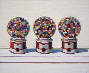
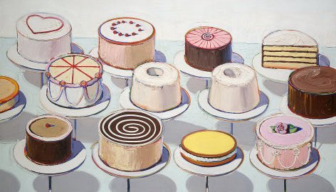
Next we entered the permanent collection which includes the works of many California artists. Positioned to the forefront; in the first room is a group of paintings by Wayne Thiebaud. Thiebaud paints with thick brush stokes of vibrant colors; bright white, edges of purple and orange. He depicts scenes of San Francisco’s rollercoaster streets and some central valley landscapes but is most known for desserts. Not deserts, no. Cakes, gumballs, pastries and pie. Boston cream pie to be exact. I love pie and really enjoy his work. It makes me hungry. But that day mixed with my hunger, was that same thought. Why does Thiebaud paint dessert?
Two great artists. One etching monumental works of powerful concept. One painting with mouth-watering precision, pie. Why the pie?
“If the world were a perfect place,” wrote Michael Kimmelman in the New York Times in 2001, “the Wayne Thiebaud retrospective that has just opened at the Whitney Museum would be nailed to the walls for good and we would be free to stop by whenever we needed to remind ourselves what happiness feels like.”
So indeed, some art may just be meant to make us happy.
Now, does anyone have a better recipe for me?